Part 2: Adding Fonts & Styling
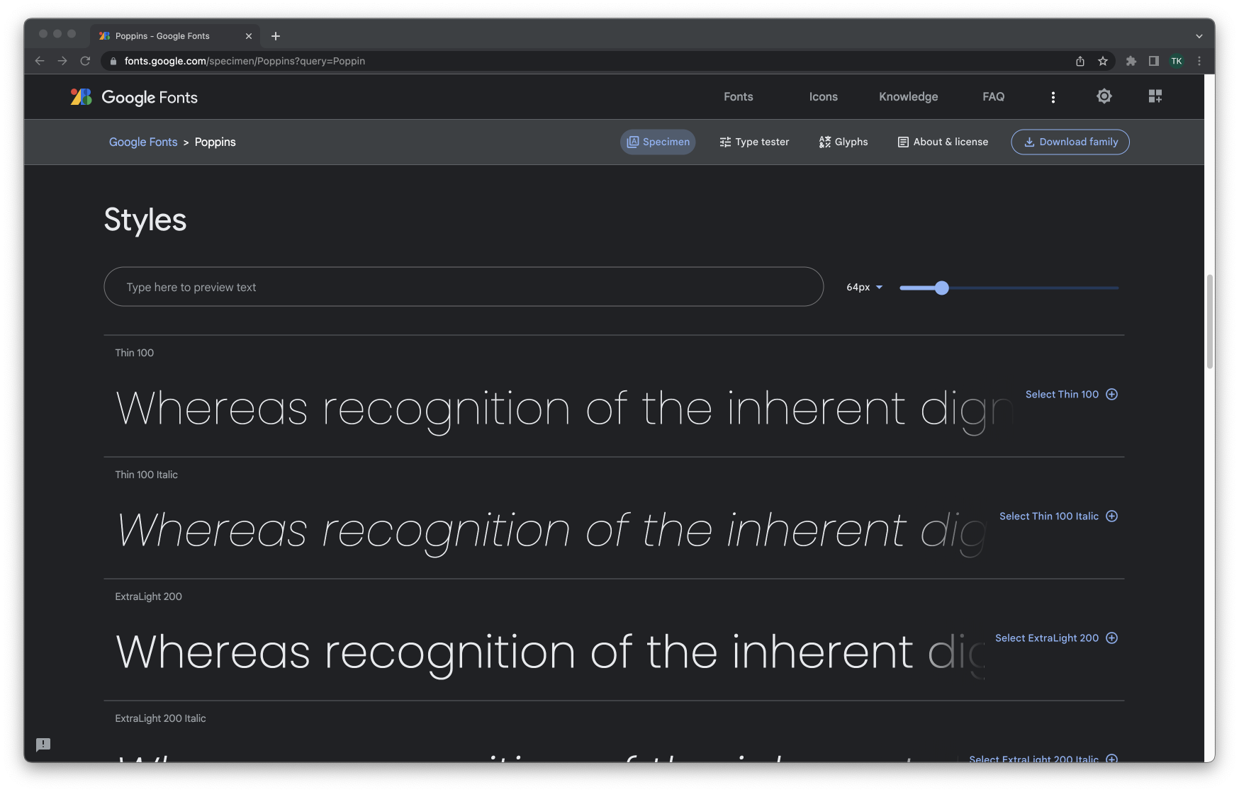
The default font being applied to our texts aren’t the prettiest, so let’s choose a better font. We’re going to be picking a font from fonts.google.com. There are many fonts provided on that site, and you can choose whatever font suits you. However for me, I really like the “Poppins” font, so I’m going choose it. You can search “Poppins” in the search field, or visit this link: https://fonts.google.com/specimen/Poppins?query=Poppin
After than, scroll down to the section titled “Styles”, as shown below:

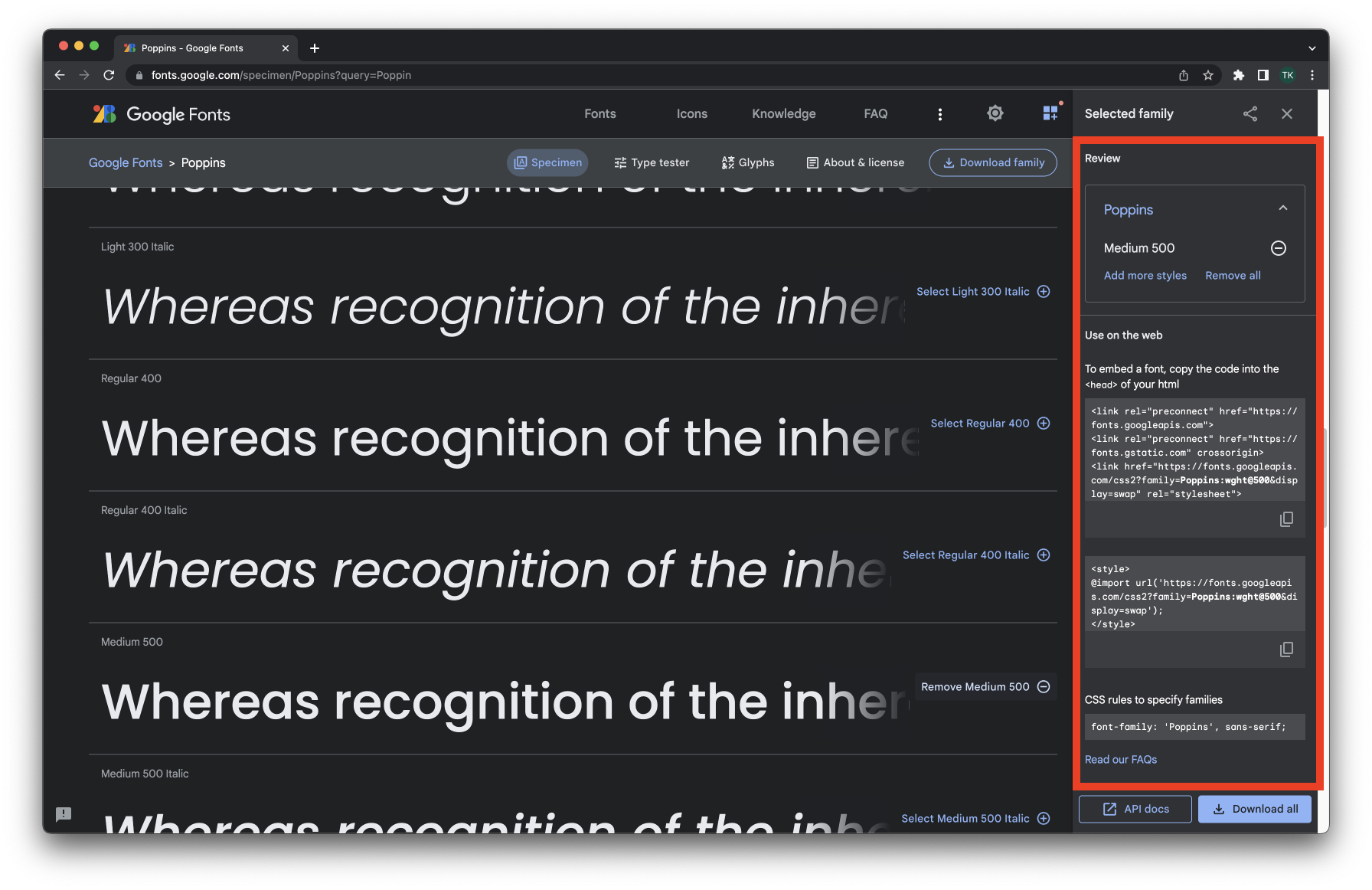
Choose which ever looks best for you, and then click the blue “Select … +” to the right of it. To the right, there will now a appear instructions on how to apply the font styles (I drew a red rectangle around the instructions)

We’re going to copy the code below into our styles.css file:
@import url('https://fonts.googleapis.com/css2?family=Poppins:wght@500&display=swap');
From here on out, we can apply the font by adding a font-family property with a value of 'Poppins', sans-serif, and the font we chose should be applied.
Let’s now try applying the font to all of the elements in out website. To do that, we can use the html selector in CSS, and apply a font-family property with a value of 'Poppins', sans-serif. Applying this property under the html selector applies the font to all elements inside the html tag.
Your code should now look similar to the following:
<!DOCTYPE html>
<html>
<head>
	<link rel="stylesheet" href="styles.css">
</head>

<body>
	<div>
		<h1>Hello</h1>
		<h2>My name is Mike James </h2>
		<p>I love playing video games and reading cartoons. When I grow up, I want to be a
 basketball player that plays in the NBA. My current favorite basketball player is Steph Curry.</p>
	</div>
</body>

</html>
@import url('https://fonts.googleapis.com/css2?family=Poppins:wght@500&display=swap');
html {
font-family: 'Poppins', sans-serif;
}
h2 {
font-size: 20px;
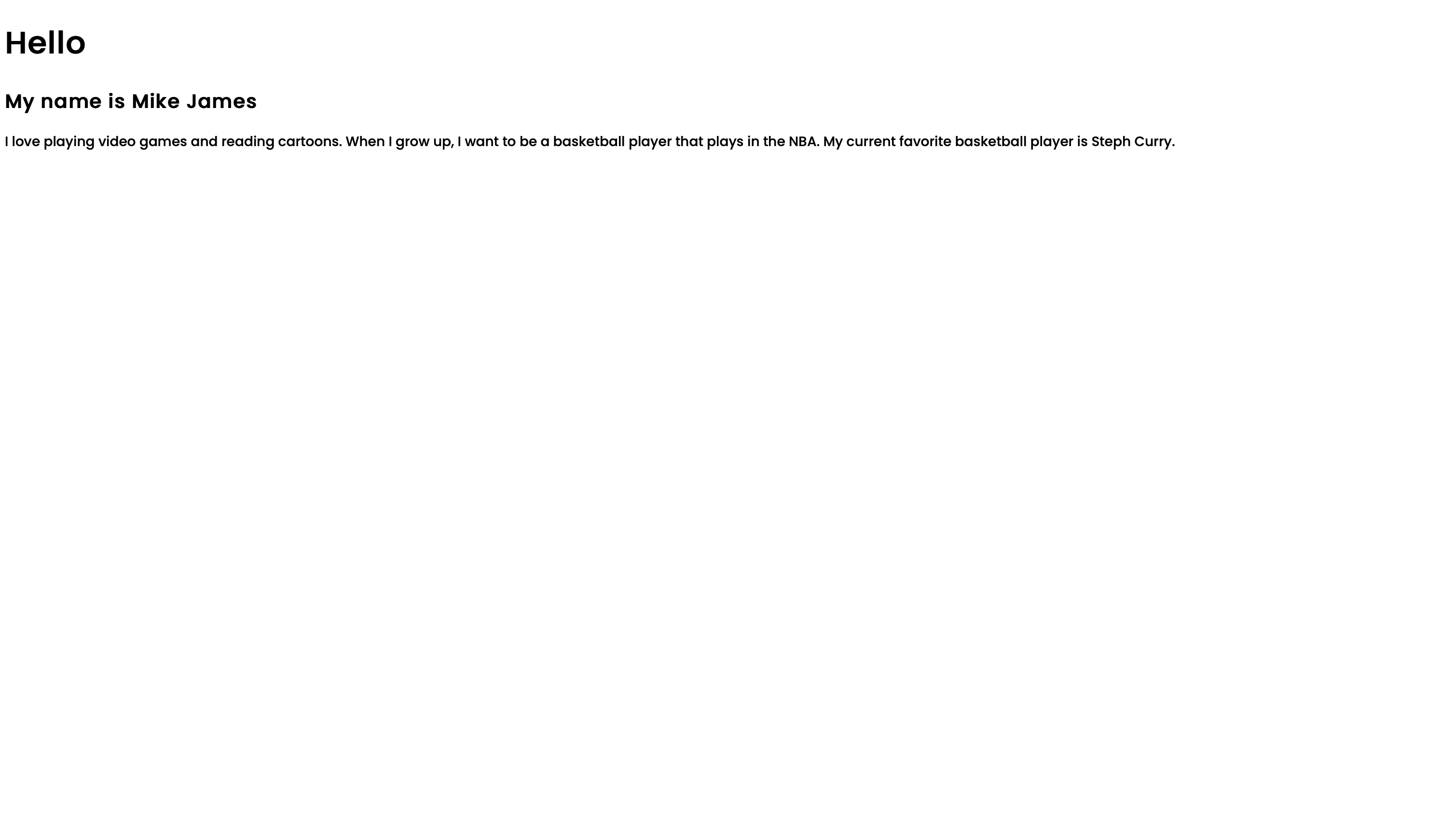
}Now, you should see the text fonts on your site to be changed. This is how my site looks like.

Let’s also made all of the contents of our website centered on the screen, and set a maximum width that we want our website to take (this is a good practice because there are many big screens/devices out there, and anyone might be accessing your site. Setting a max-width ensures that your site layout won’t stretch past what you specified, therefore not ruining your styles).
We’re going to add a max-width property inside the html selector in our CSS file, and set its value to be 700px. Also lets add some margins, which will allow our elements to be centered on the screen.
Your styles.css file should look as follows:
@import url('https://fonts.googleapis.com/css2?family=Poppins:wght@500&display=swap');
html {
	font-family: 'Poppins', sans-serif;
	max-width: 700px;
	margin: 0 auto;
}
h2 {
	font-size: 20px;
}
You see that we used margins differently than how we used then in the previous lesson. There are two values specified in the margin property, instead of one. This is allowed, and when you specify one value in the margin property, it makes that the margin value around the whole element, but when you include two values, the first applies the margin value to the top and bottom of the element, while the second value adjusts the margins to the right and left of the element.
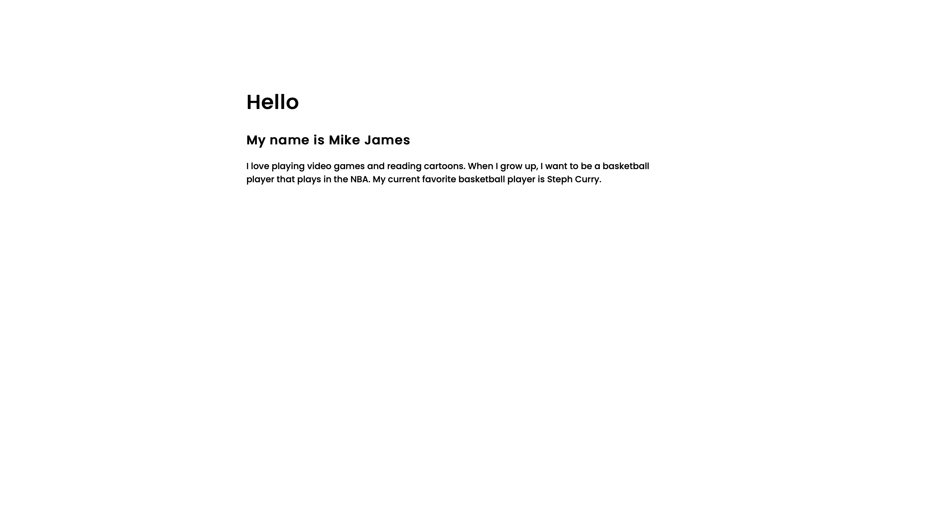
We put the first margin value (top and bottom margins) to be 0 because we don’t want to adjust those values. For the left and right margins, we put the unique value of auto, which ensures that there are equal margins to the left and right of the element, therefore centering it on the screen. Your website should now look like the following:
