Lesson: Spacing in CSS/Box modal
One very important concept we haven’t talked about yet is element spacing in CSS. Spacing dictates the spacing that an HTML tag covers on the web page, and there are different types of spacing to use.
To help you understand it better, look at the following diagram:
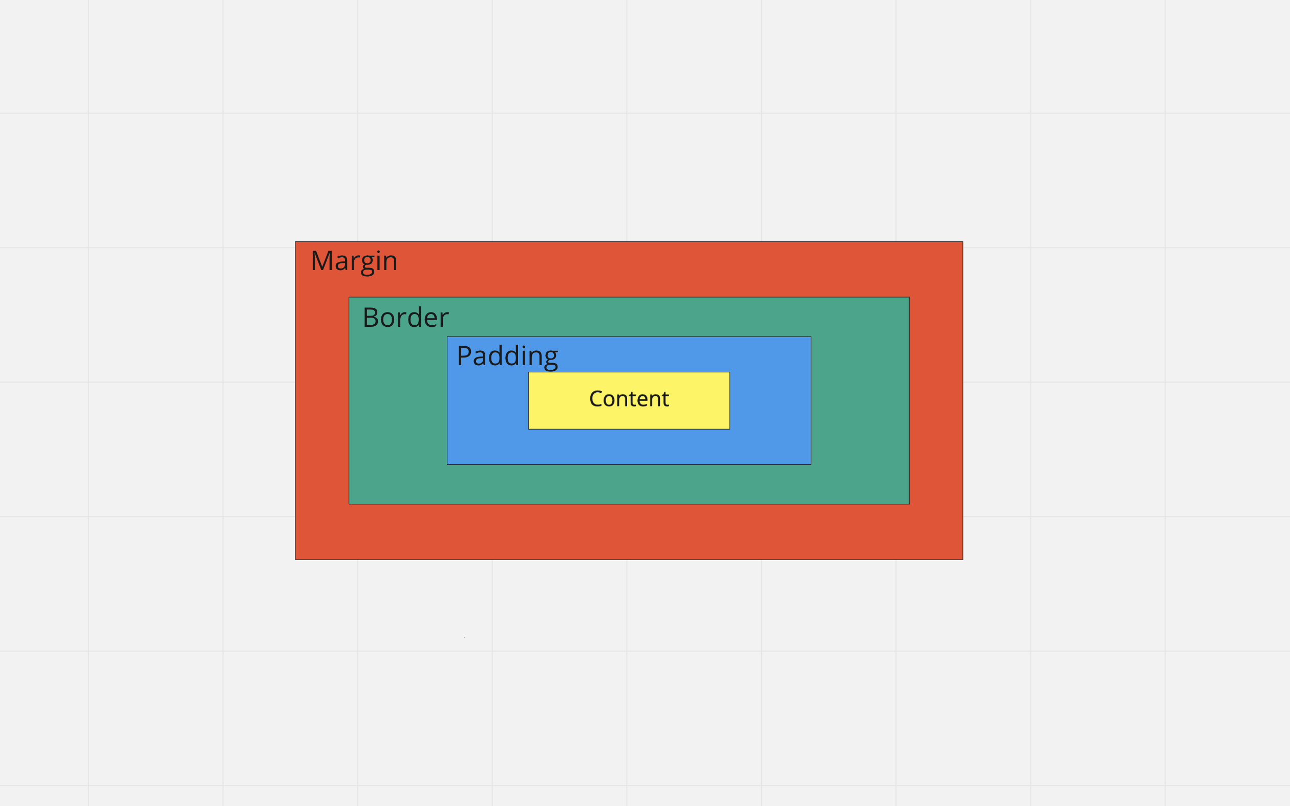
There are 4 types of spacing in CSS. The first is the spacing of the content itself: this will be the HTML tags, as well as any width/height CSS properties applied to them. The second is padding. Padding adds spacing around the content (HTML tags). Then, there is the border. The border goes around the padding and content. The last one is margin spacing: which is spacing applied to the outside of border, padding, and content spacing. The diagram above describes the “Box Modal” in CSS spacing.
Let’s look at an example:
Here, we’ll create a new HTML file with the following contents:
<!DOCTYPE html>
<html>
<head>
	<style>

	</style>
</head>

<body>
	<div>
		<h1>Hello</h1>
	</div>
</body>

</html>
(The styles will be included in the same file as this is a quick demonstration, however, its a good practice to keep CSS and HTML files separate)
Your output screen should look like this:
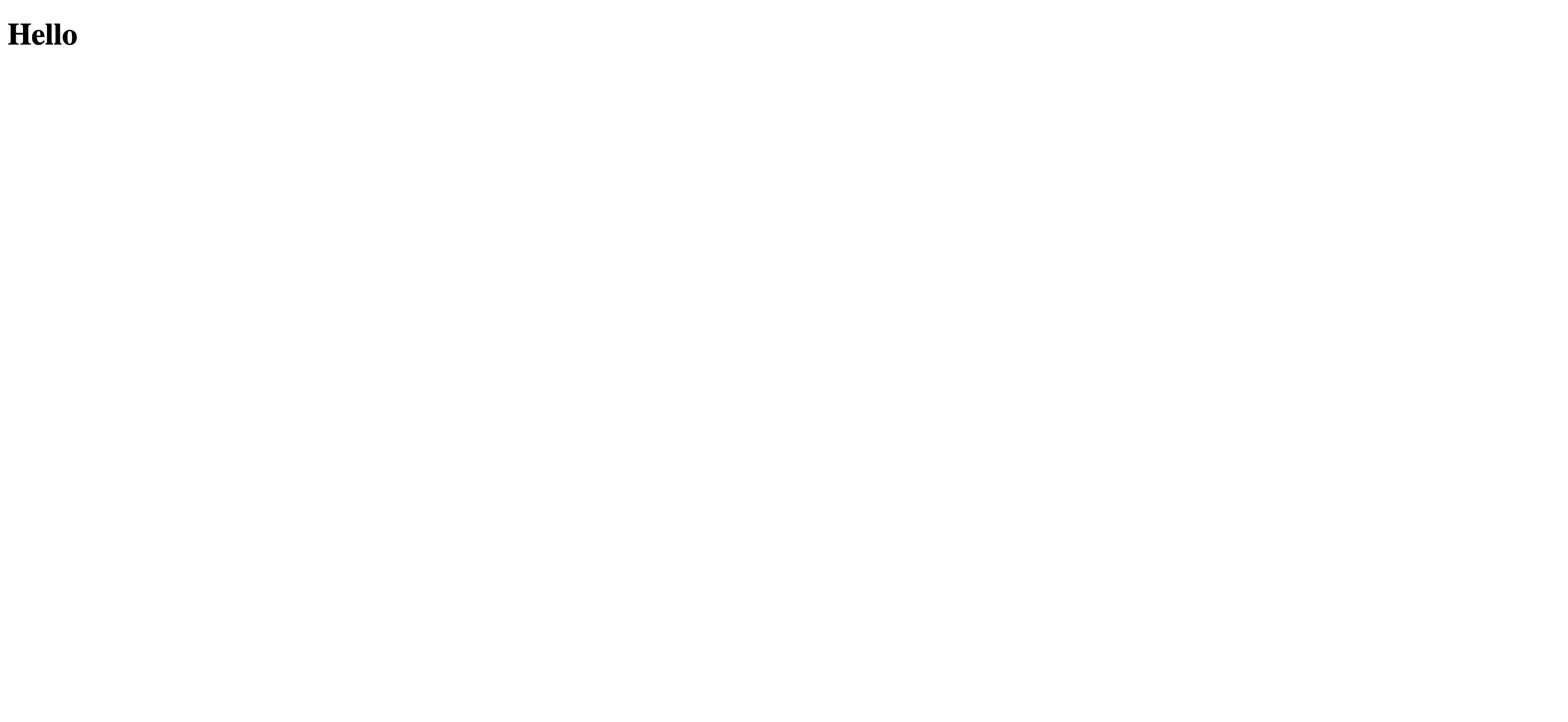
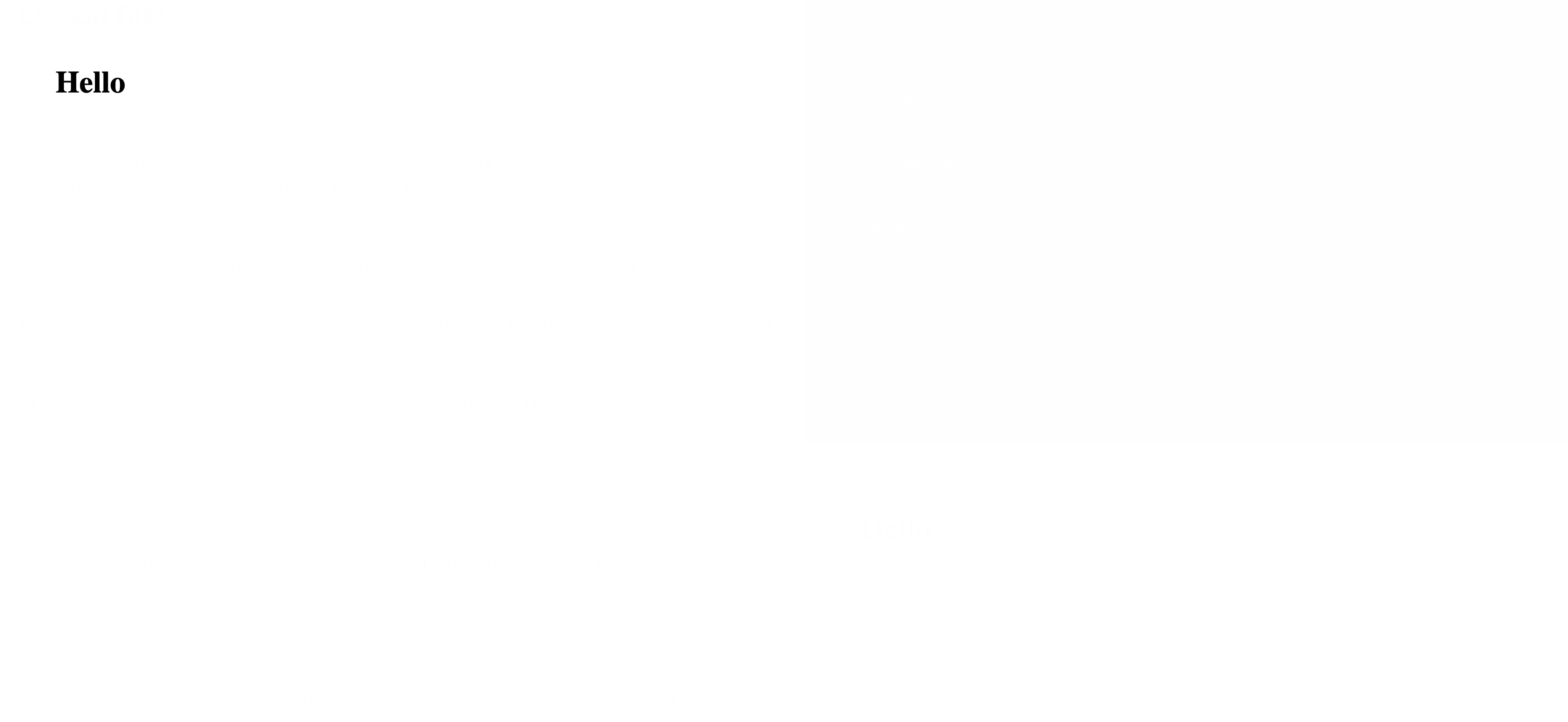
There is one h1 tag, which has no margin, border, or padding applied. The only space that the h1 element occupies is the space it takes to display Hello on the website. The is a visual representation of the space that the h1 tag takes on the screen:

The blue part is the space that the h1 tag takes. You can see that it takes just enough height, but also it takes all the available width on the screen This is because of a default property applied to the h1, and other, tags, which is the display:block CSS property. You can think of this property as having the element take up the whole width of it’s available width, which in this case is the whole screen width.
Anyways, back to the box modal. Now let’s try to add padding to our h1 tag and see what happens:
<!DOCTYPE html>
<html>
<head>
	<style>
		h1 {
			padding: 50px;
		}
	</style>
</head>

<body>
	<div>
		<h1>Hello</h1>
	</div>
</body>

</html>
Now your screen should show the following:
As you can tell, the Hello moved to right and down a little bit. This is because of the 50px padding we added. This applies 50px padding on all sides around the “content” box, which is the text Hello.

The image above shows the same blue region, which is the content box, but because of the padding we added, we also seen the green region, which is the 50px padding.
Now lets add some border spacing:
<!DOCTYPE html>
<html>
<head>
	<style>
		h1 {
			padding: 50px;
			border: 20px solid red;
		}
	</style>
</head>

<body>
	<div>
		<h1>Hello</h1>
	</div>
</body>

</html>
We can’t just do border:20px; in CSS, we must also include other properties of the border we want. In this case, we want a 20px solid red border around the padding (there are other values to put instead of solid, such as dashed, apply it as see what happens). You should see the following output on your screen:
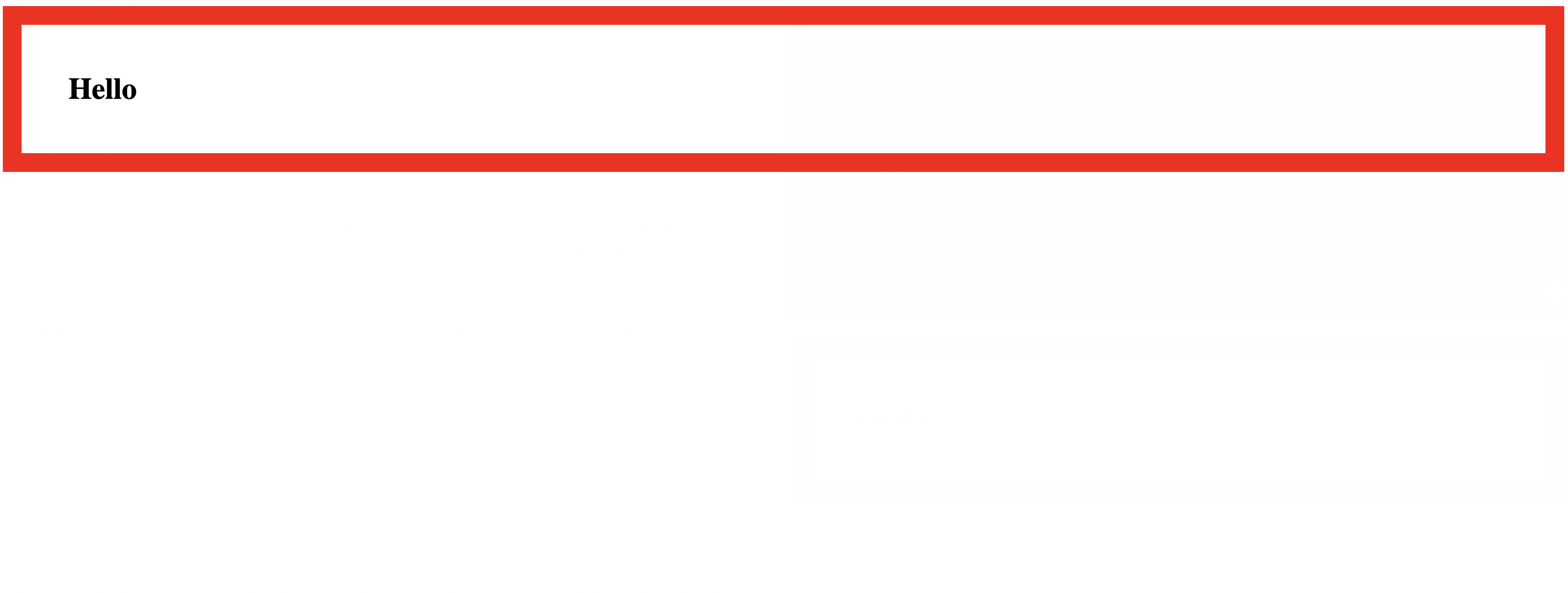
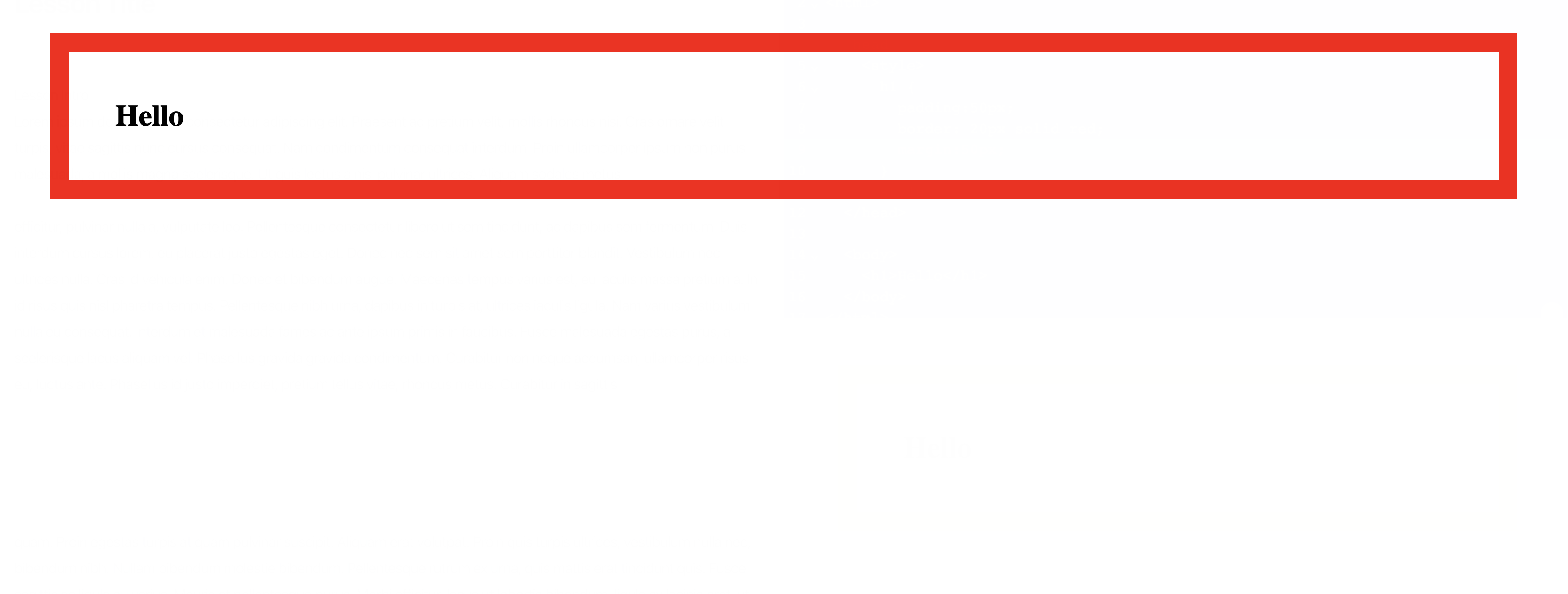
There is a now a think black border around the padding and content spacing of the h1 tag. Now, let’s add the last value, margin:
<!DOCTYPE html>
<html>
<head>
	<style>
		h1 {
			padding: 50px;
			border: 20px solid red;
			margin: 50px;
		}
	</style>
</head>

<body>
	<div>
		<h1>Hello</h1>
	</div>
</body>

</html>
You should see the following:
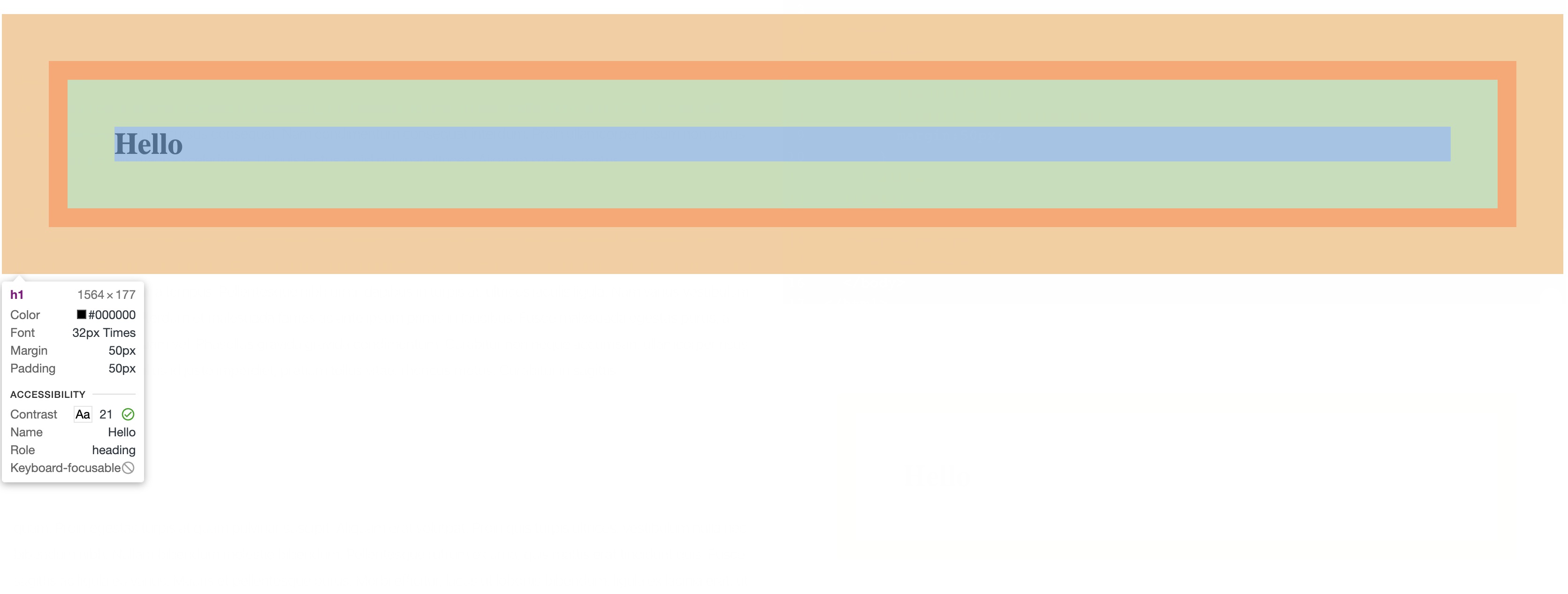
The below image shows a better representation of the spacing used in the h1 tag. The blue region is the content spacing, the light green is the padding, the dark orange is the border, and the light orange is the margin.
Note that padding, border, and margin values can also be position as well as negative values (try putting -100px for the margin property and see how your website turns out).
These 4 types of spacings allow out to adjust the layout of our elements however we want, and these concepts are going to become really useful as we finish building our personal website.