Part 4: Finishing Styles
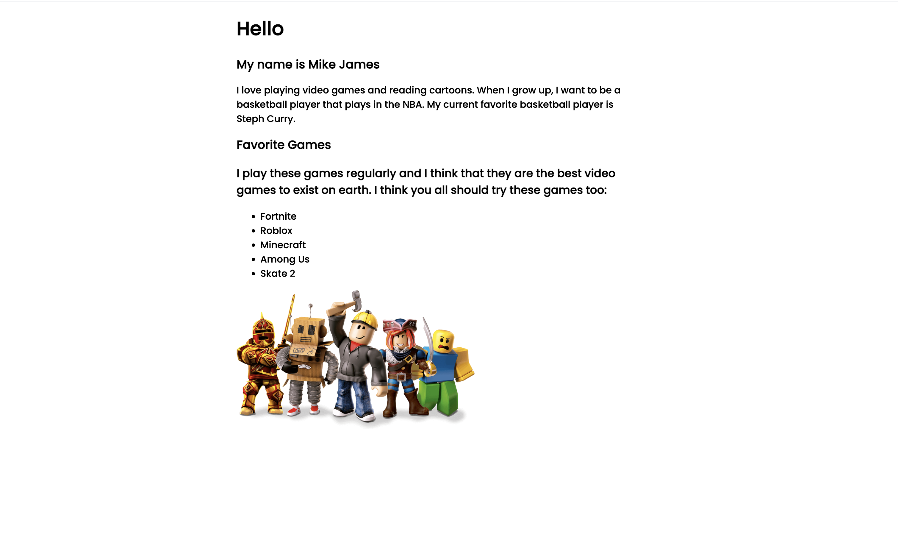
For step #6, we’re going to add CSS styles to make it look prettier. To recall, you’re website should look similar to the following:
First of all, we’re going to create spacing between the introduction part, and the Favorite Games part. Let’s add a top margin with a value of 40px to the div tag with a class value of games. Add these styles to your styles.css file:
@import url('https://fonts.googleapis.com/css2?family=Poppins:wght@500&display=swap');
html {
font-family: 'Poppins', sans-serif;
max-width: 700px;
margin: 0 auto;
}
h2 {
font-size: 20px;
}
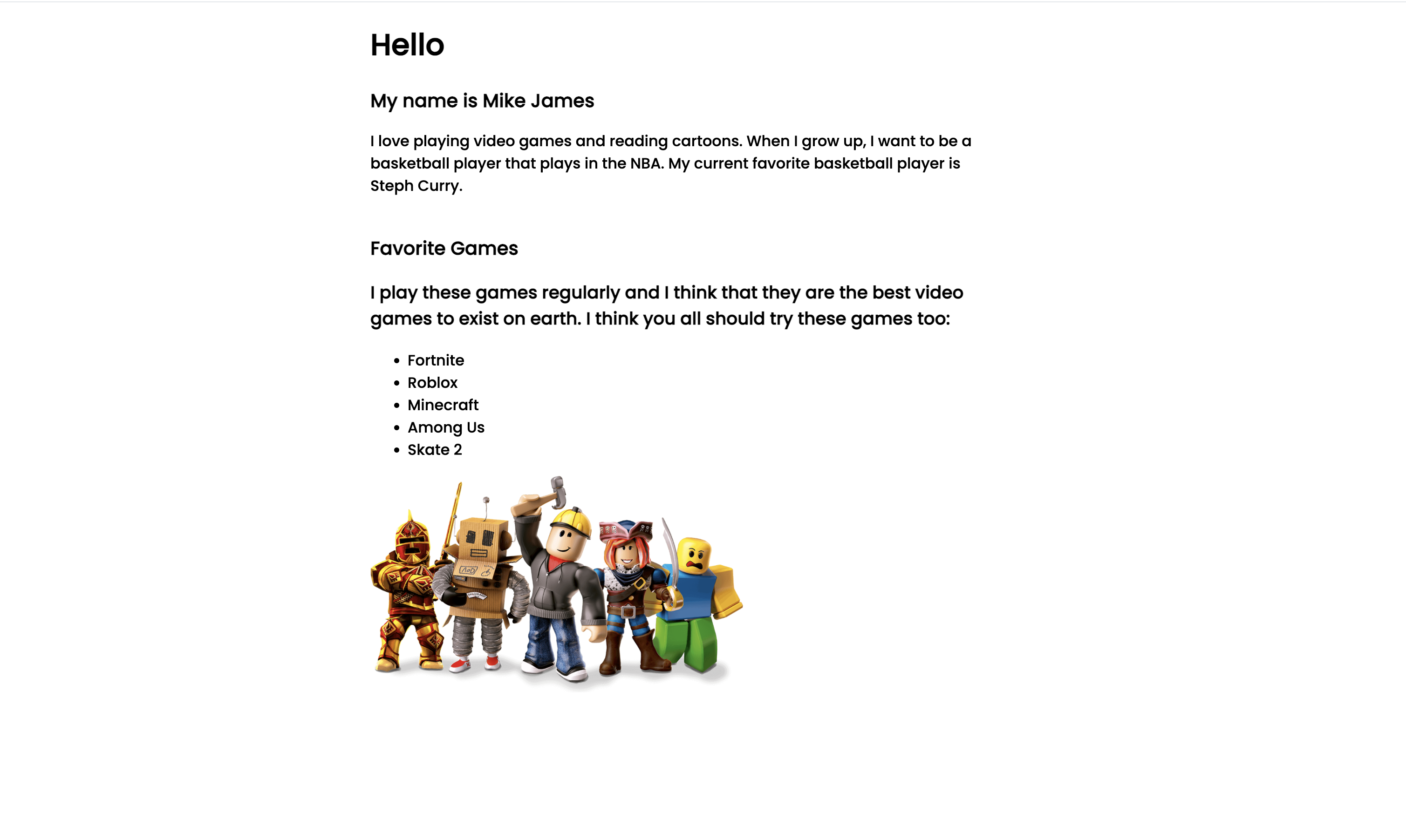
.games {
margin-top:40px;
}We used the margin-top property, which unlike the margin property, it only applies the margin to the top of the element. There should now be some spacing between the intro part and the games part:
Let’s change the background color of the games div tag. To change the background, we going to add the following line to the .games selector in styles.css: background-color: rgb(149, 149, 255);.
This line of code is telling the computer to change the background color of an element on a webpage. The color is a shade of blue. The letters 'rgb' stand for red, green, and blue, which are the three primary colors used to create other colors on a computer screen. The numbers '149, 149, 255' are the values for each of those primary colors. This line of code specifically is mixing 149 units of red, 149 units of green and 255 units of blue which results in a shade of blue. This line of code will set the background color of the element it's applied to this shade of blue.
You can play around with the red, green, and blue unit values to see if you get a color you like, or you can include a more specific color like blue, red, lightblue, etc.
Let’s also change the color of the text of our “Favorite Games” section to be white.
Your styles.css file should look like the following:
@import url('https://fonts.googleapis.com/css2?family=Poppins:wght@500&display=swap');
html {
font-family: 'Poppins', sans-serif;
max-width: 700px;
margin: 0 auto;
}
h2 {
font-size: 20px;
}
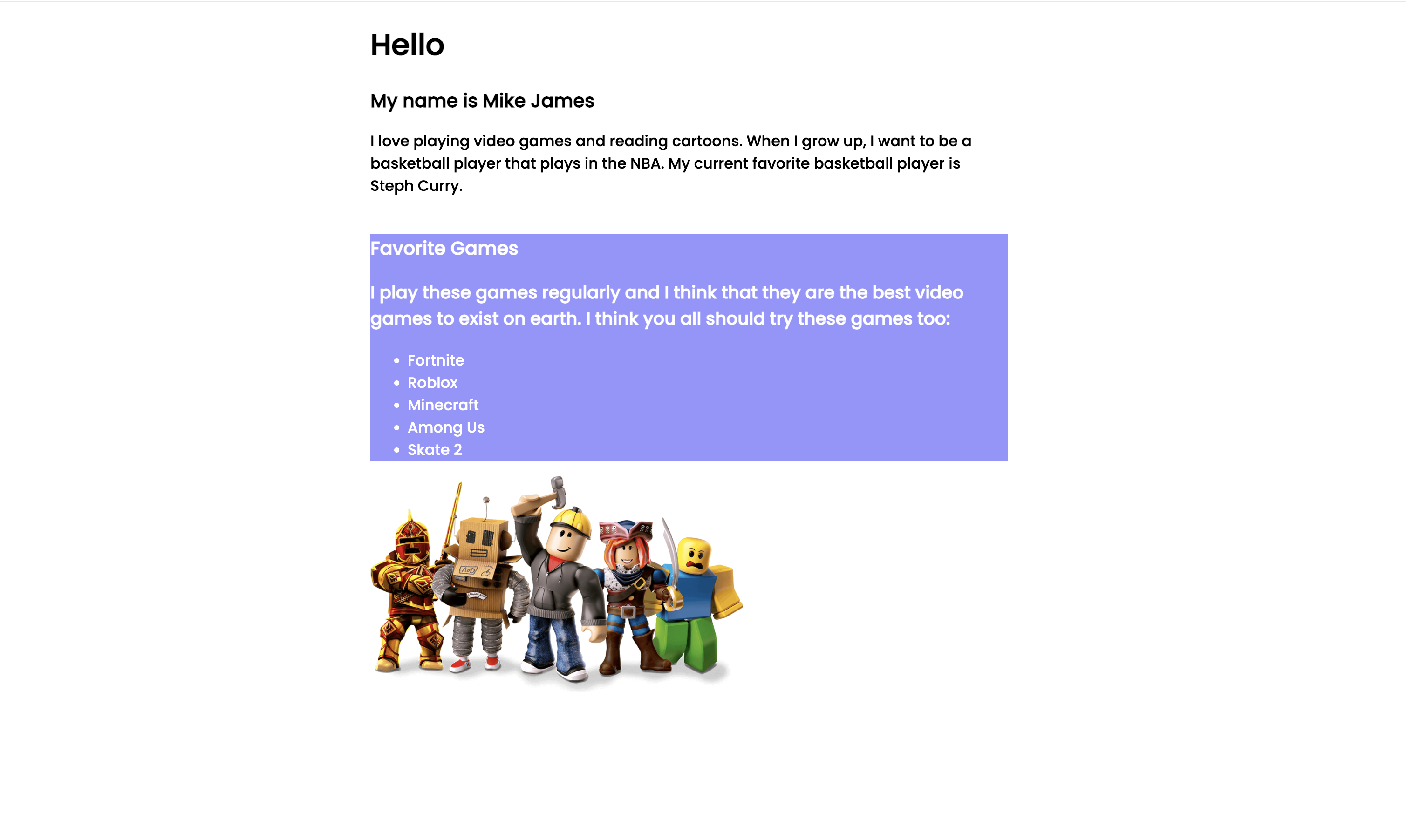
.games {
margin-top:40px;
background-color: rgb(149, 149, 255);
color:white;
}Your website should look like the following:
To make the corners of div container rounded, we’re going to add border-radius property with a value of 50px, and since the text seems to be tightly close to the edges of the container, let’s also add some padding:
@import url('https://fonts.googleapis.com/css2?family=Poppins:wght@500&display=swap');
html {
font-family: 'Poppins', sans-serif;
max-width: 700px;
margin: 0 auto;
}
h2 {
font-size: 20px;
}
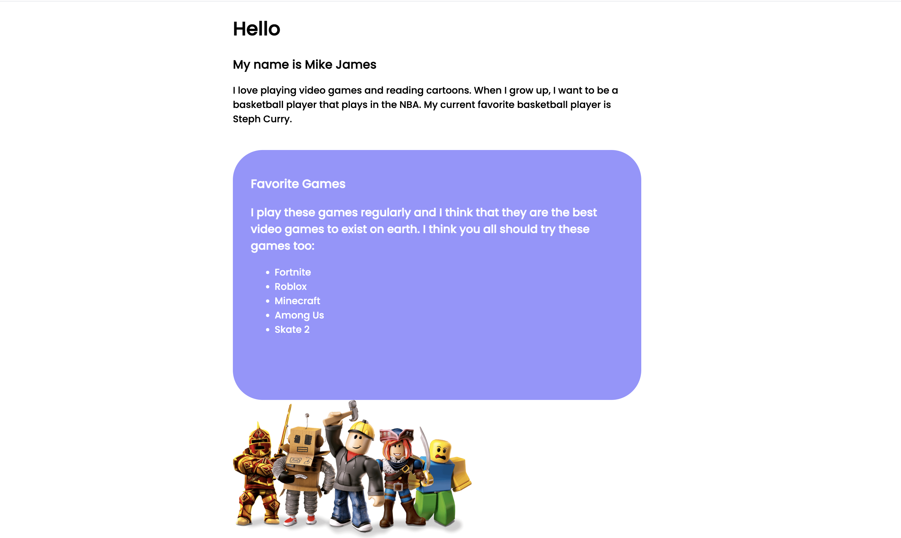
.games {
margin-top:40px;
background-color: rgb(149, 149, 255);
color:white;
border-radius: 50px;
padding: 25px 30px;
padding-bottom: 90px;
}Your website should now look like the following:
For the h3 tag describing the games we list, let’s make its font-size smaller, something like 14px should work:
@import url('https://fonts.googleapis.com/css2?family=Poppins:wght@500&display=swap');
html {
  font-family: 'Poppins', sans-serif;
  max-width: 700px;
  margin: 0 auto;
}
h2 {
  font-size: 20px;
}
.games {
  margin-top:40px;
  background-color: rgb(149, 149, 255);
  color:white;
  border-radius: 50px;
  padding: 25px 30px;
  padding-bottom: 90px;
}

h3 {
	font-size:14px;
}
Now, let’s style our games list. We’re going to use the selector .games-list to style the list because we gave the ul tag a class value of games-list.
First off, we want the games to be displayed next to each other, not every game taking a full line, so let’s use flexbox. Also, to remove the bullet points from the list items, we can use the property list-style:none;
@import url('https://fonts.googleapis.com/css2?family=Poppins:wght@500&display=swap');
html {
  font-family: 'Poppins', sans-serif;
  max-width: 700px;
  margin: 0 auto;
}
h2 {
  font-size: 20px;
}
.games {
  margin-top:40px;
  background-color: rgb(149, 149, 255);
  color:white;
  border-radius: 50px;
  padding: 25px 30px;
  padding-bottom: 90px;
}

h3 {
  font-size:14px;
}

.games-list {
  display: flex;
  list-style:none;
}
The result:
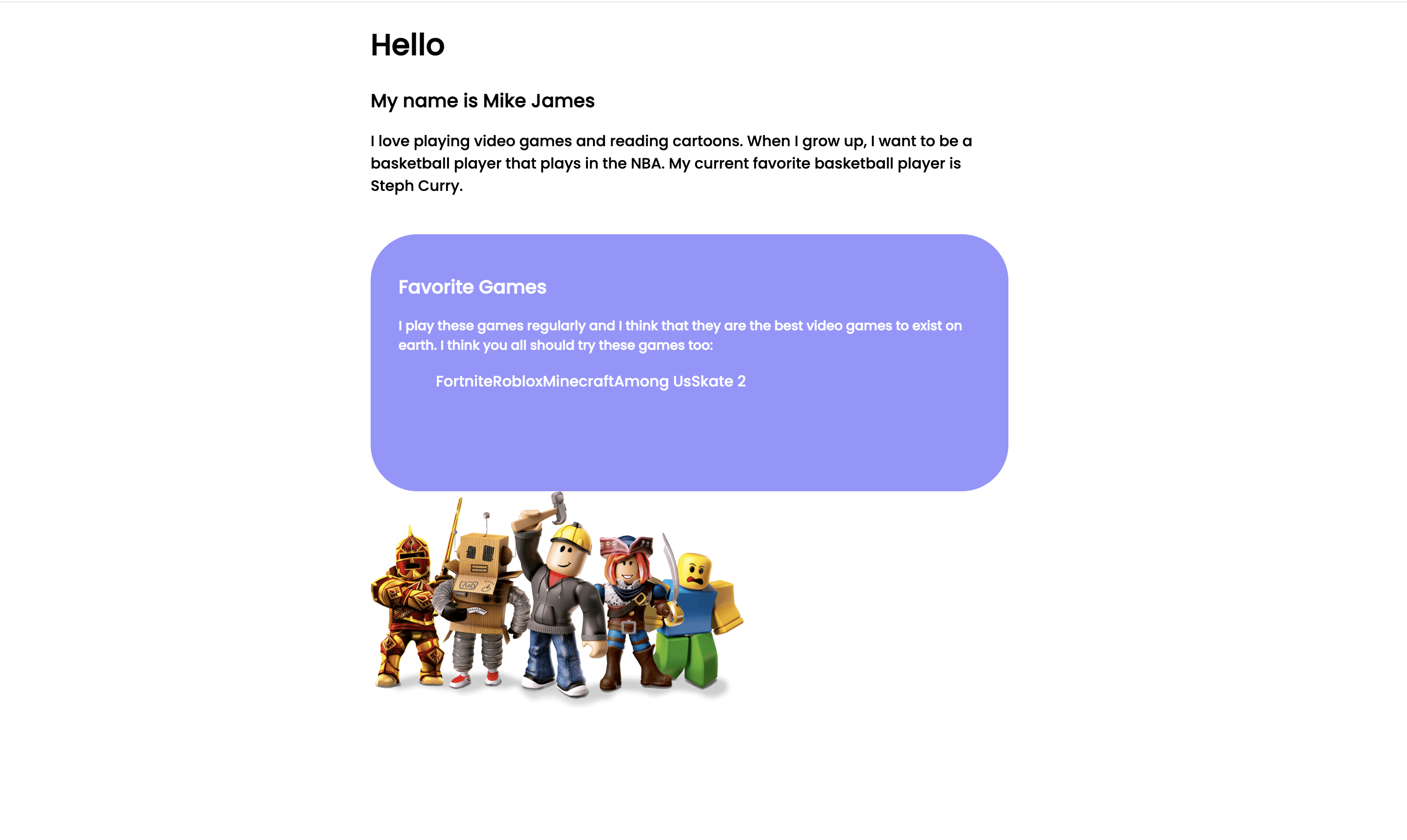
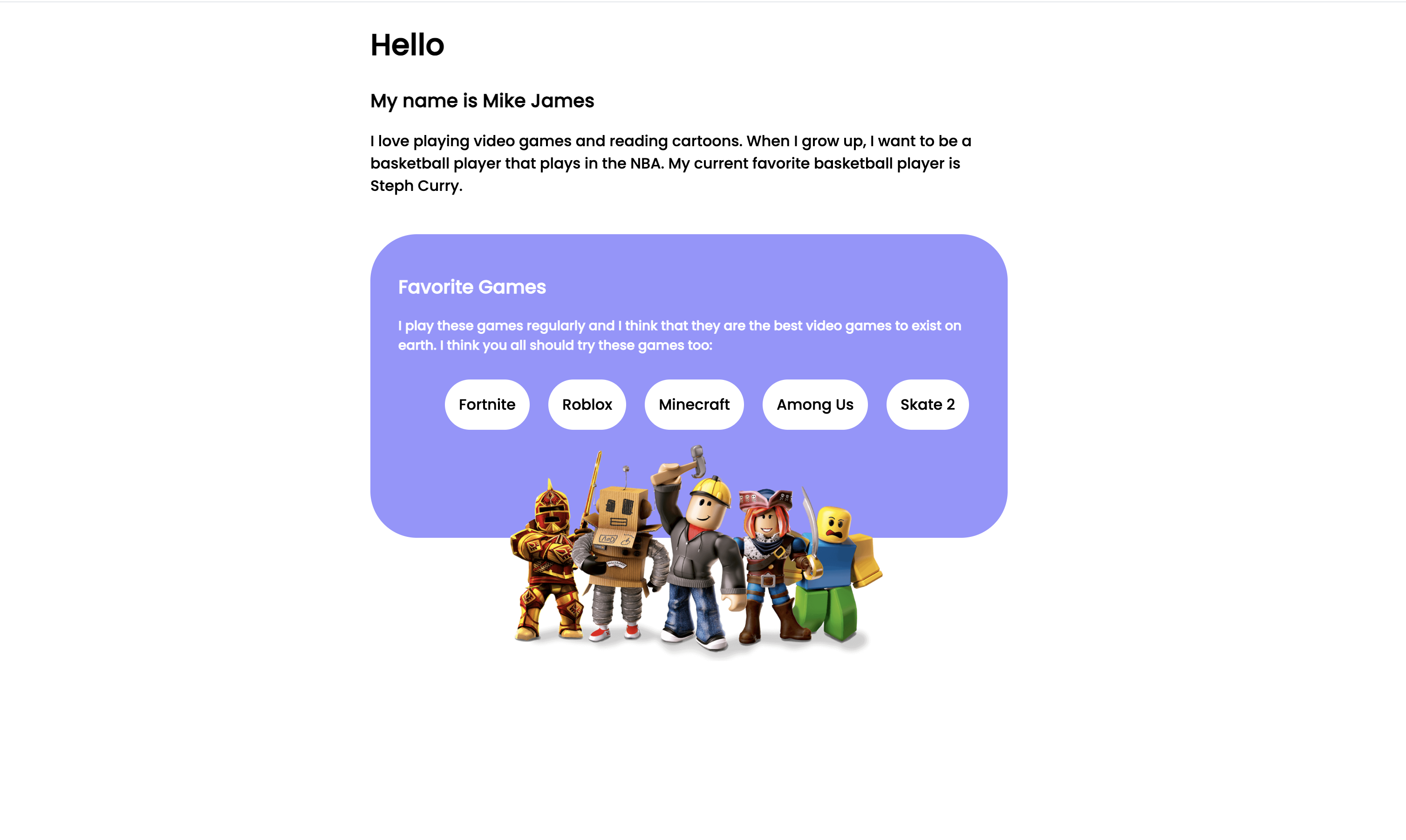
The games are tightly spaced, so let’s style them next. To select the li tags, where going to use a different selector: .games-list > li.
We haven’t used this type of selector before, but explaining it is very simple.
The '.' before "games-list" indicates that this is a class selector, which means it is selecting elements that have the class "games-list" (As we already seen). The '>' symbol is called a "child combinator" . it specifies that we are looking for the direct children of the element with the class "games-list". The 'li' after the '>' symbol is the HTML tag for a list item. So this CSS selector is selecting all the list items that are direct children of an element with class "games-list" In simpler terms, this CSS selector is used to style all the direct child list items of an element with class "games-list" on a webpage.
For the list items, we going to add padding, a white background color, a border radius to round the edges of the background, make the game text black, and add a margin of 10px so the list items are not tightly packed together as show in the image above. The contents of your style.css file should look like this:
@import url('https://fonts.googleapis.com/css2?family=Poppins:wght@500&display=swap');
html {
  font-family: 'Poppins', sans-serif;
  max-width: 700px;
  margin: 0 auto;
}
h2 {
  font-size: 20px;
}
.games {
  margin-top:40px;
  background-color: rgb(149, 149, 255);
  color:white;
  border-radius: 50px;
  padding: 25px 30px;
  padding-bottom: 90px;
}

h3 {
  font-size:14px;
}

.games-list {
  display: flex;
  list-style:none;
}
.games-list > li {
  padding: 15px;
  border-radius: 50px;
  background-color: white;
  color: black;
  margin: 10px;
}
The extra padding-bottom property is added to make space for image. You’re going to see how it will become useful soon.
We’re almost done! The last thing to style is the image we added.
For the image-container (the div tag with a class attribute of image-container)
Absolute Positioning
We’re going to use a CSS property we haven’t used before, which is the position property. This will allow us to control the position of our image. Specifically, we’re going to useposition: absolute;.
The CSS attribute position: absolute; is used to control the positioning of an element on our website.
When an element has a position of 'absolute', it means that the element is positioned relative to its nearest positioned ancestor, instead of being positioned relative to the viewport, or the elements that come before it in the HTML.
An element with 'position: absolute' is also removed from the normal flow of the document and does not affect the position of other elements. This allows you to position the element exactly where you want it on the webpage, using the 'top', 'bottom', 'left', and 'right' properties.
In simpler terms, this CSS attribute is used to position an element exactly where you want it on a webpage, and it doesn't affect the position of the other elements on the page.
Styling Image
To style our image-container, we’re going to use absolute positioning, and using some of flexbox’s properties to help us center it on the screen. Add the following to your styles.css file:
.img-container {
  position: absolute;
  display: flex;
  justify-content: center;
  width: 700px;
  margin-top: -100px;
}
We already explain the position:absolute; property. We’re using display:flex;, justify-content: center; and width: 700px; to center the image on our screen: Lastly, we added a top margin of -100px to move the image upwards on the screen so the component looks like the following:
Don’t worry, this is the hardest part of our website design. Next, we’re going to add a “Favorite Movies/TV Shows” section.