Lesson: Flex box
To move forward with designing our website, we must first learn about Flexbox in CSS.
Flexbox is a way to make sure things on a website look good and fit properly, no matter what size the screen is. It's like a tool that helps you put all the different pieces together in the right way. For example, let's say you want to make a row of boxes on a website. With Flexbox, you can make sure that no matter how wide or narrow the screen is, those boxes will always be the same size and in a line. And if the screen is very wide, the boxes will spread out a bit more. It's also like playing with building blocks. You can stack them up, put them next to each other, or even make them overlap. Flexbox helps you control how all of the different parts of a website fit together and look. In simpler term, Flexbox is a way of arranging items in a container in a specific way. It make sure that everything is aligned and spaced out nicely, no matter how big or small the screen is.
Let’s look at and example of 5 different boxes (h1 tags with a solid red border around them), and how we can change their positioning by using Flexbox. The starter code is already given to use:
<!DOCTYPE html>
<html>
<head>
	<style>
		h1 {
			border: 10px solid red;
		}

	</style>
</head>

<body>
	<div>
		<h1>Box 1</h1>
		<h1>Box 2</h1>
		<h1>Box 3</h1>
		<h1>Box 4</h1>
	</div>
</body>

</html>
The website should look like this:
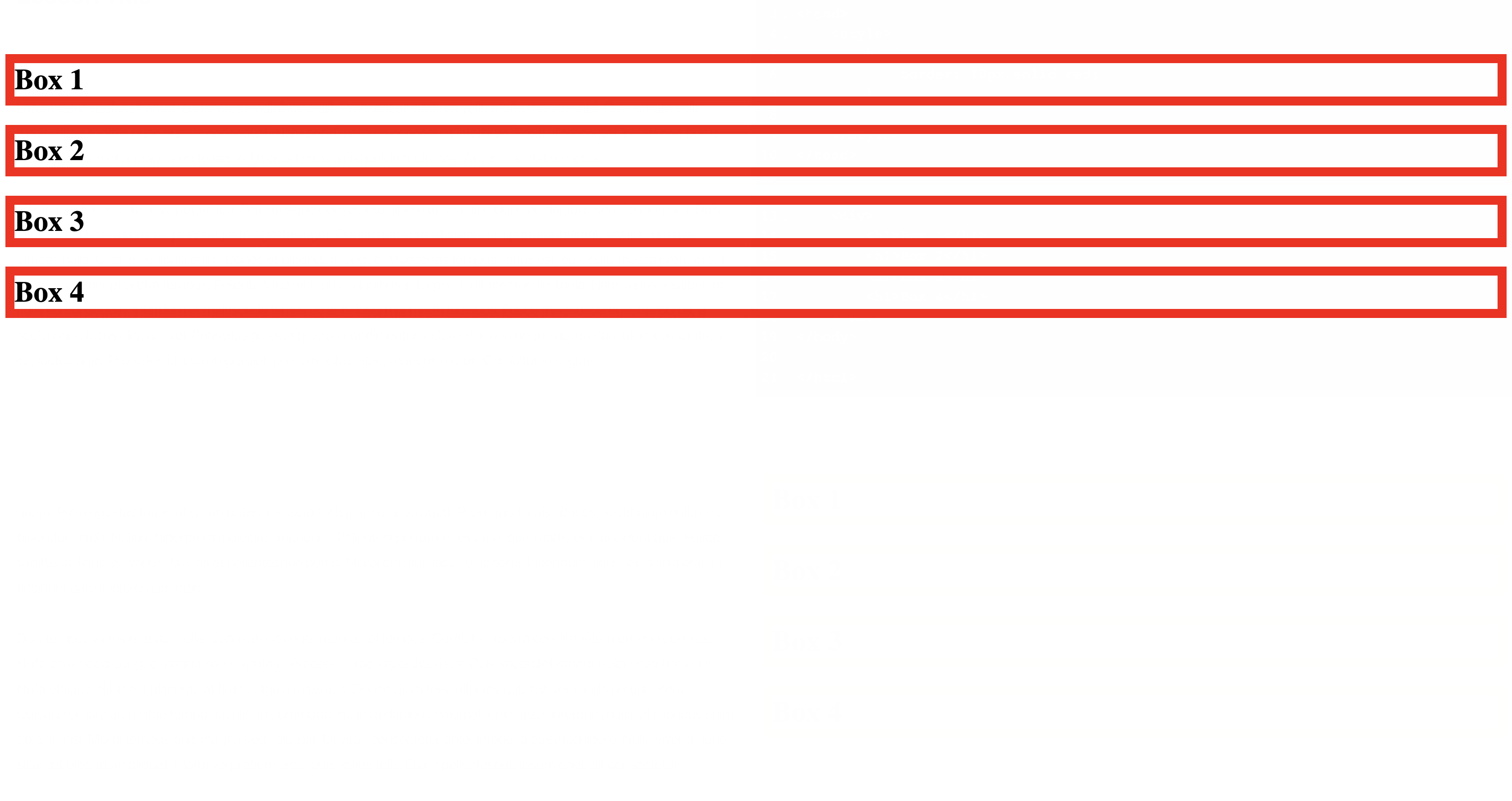
We surrounded the h1 tags with a div tag, which we will use to adjust the layout of the h1 tags.
Now, add a new display:flex; property to the div tag, and your blocks should be stacked up in a row, instead of each tag taking up the whole width of the screen:
<!DOCTYPE html>
<html>
<head>
	<style>
		h1 {
			border: 10px solid red;
		}
		div {
			display: flex;
		}
	</style>
</head>

<body>
	<div>
		<h1>Box 1</h1>
		<h1>Box 2</h1>
		<h1>Box 3</h1>
		<h1>Box 4</h1>
	</div>
</body>

</html>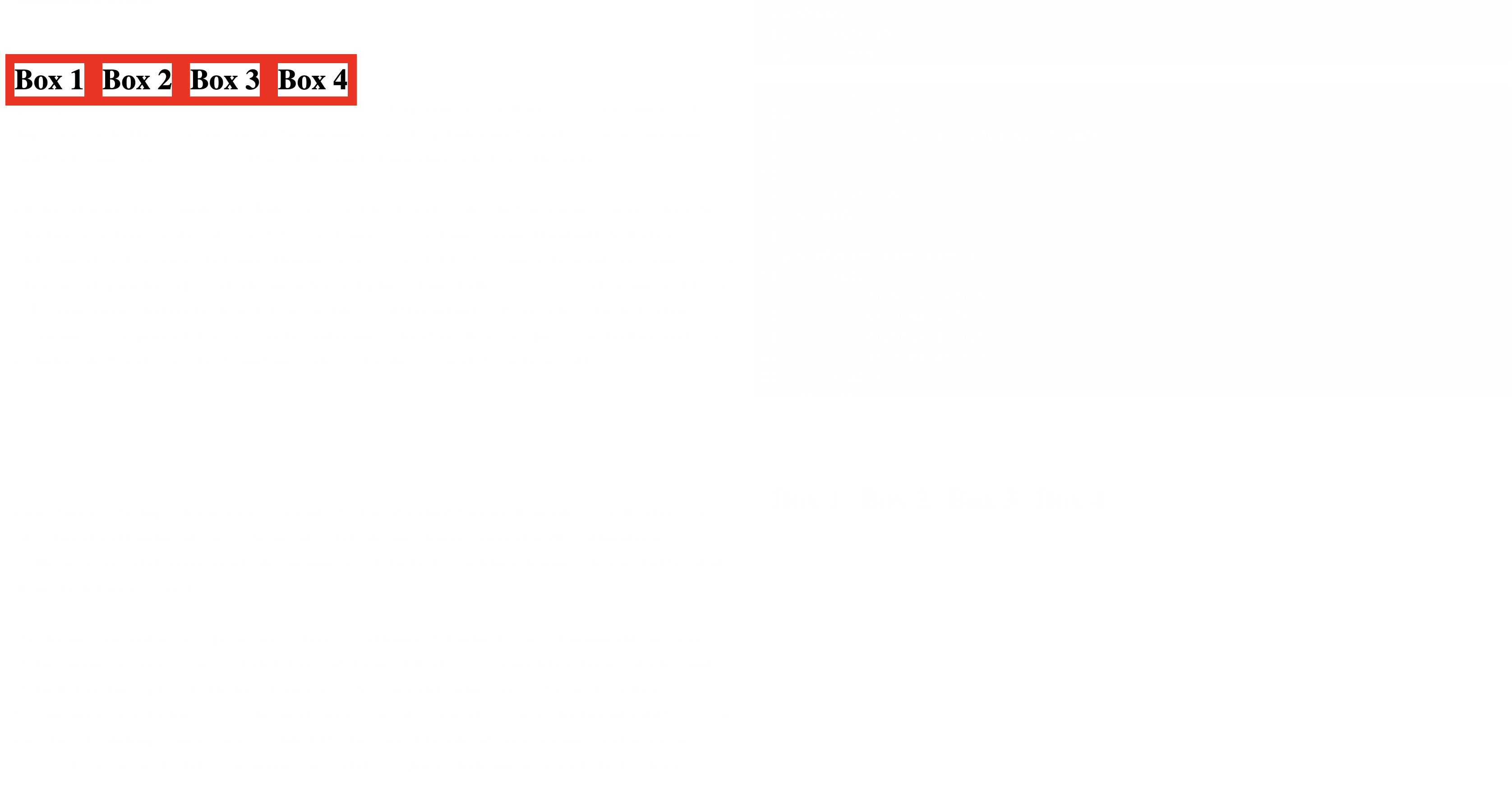
The default behavior of flexbox is to align the items in rows, but if you wanted each element to take up the whole width, you can add flex-direction:column;(the default value is row), which will make items aligned in columns.
The h1 tags seem to be tightly sticked to each other, so add a right margin of 20px to them:
<!DOCTYPE html>
<html>
<head>
	<style>
      div {
        display:flex;
      }
		h1 {
			border: 10px solid red;
      margin-right:20px;
		}

	</style>
</head>

<body><br/><br/><br/>
	<div>
		<h1>Box 1</h1>
		<h1>Box 2</h1>
		<h1>Box 3</h1>
		<h1>Box 4</h1>
	</div>
</body>

</html>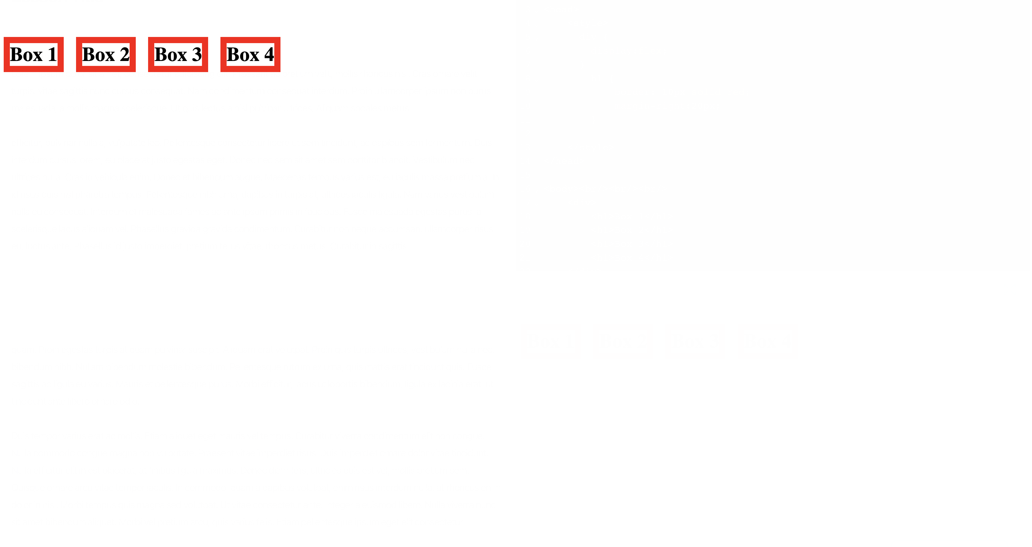
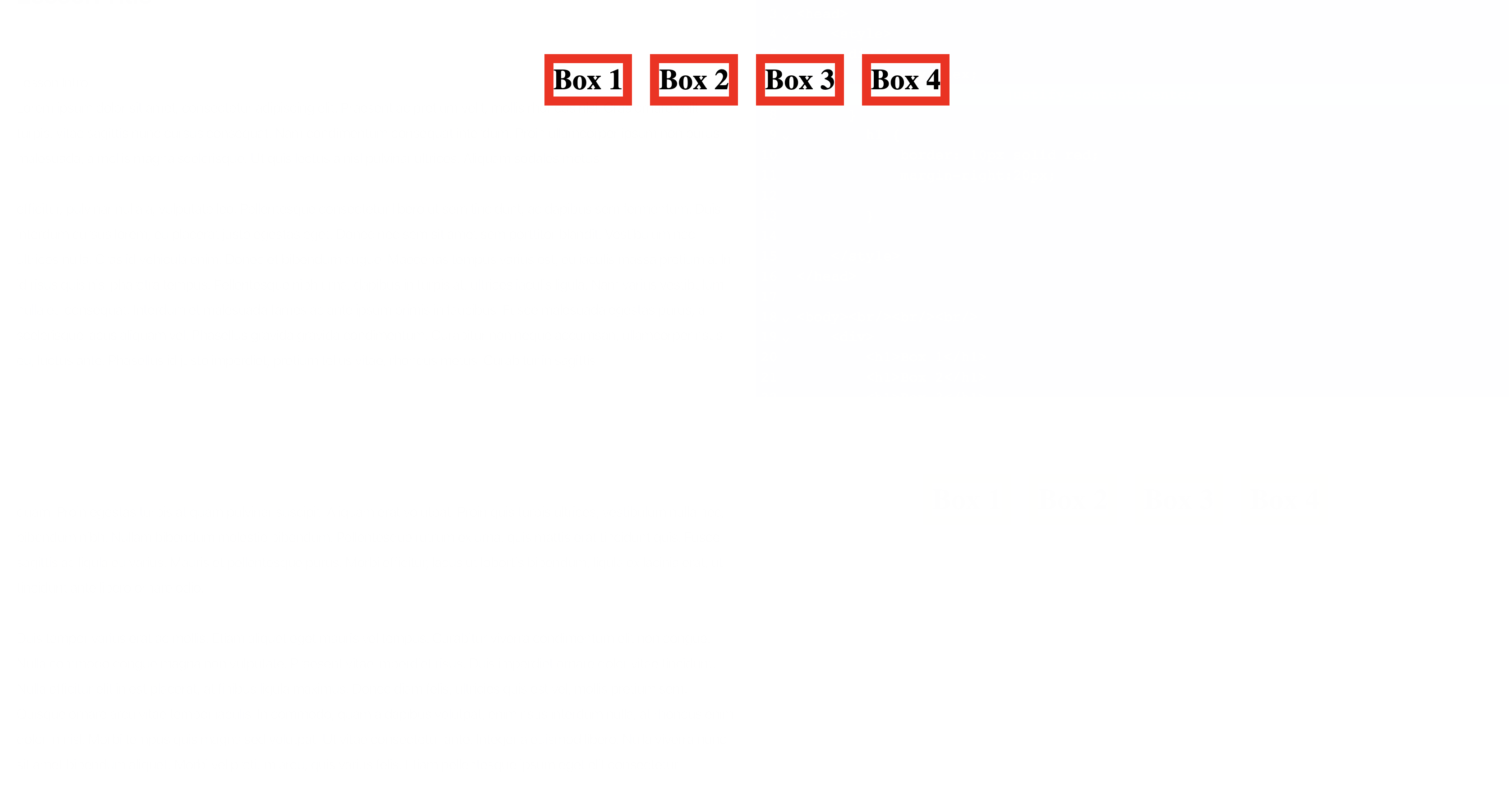
Now that the elements are laid out using flexbox, we can use a couple of new properties to easily move them around the screen and move them around. For example, if we wanted to center the elements, we just add a justify-content:center; inside the div selector.
The justify-content property controls how elements are aligned along the main axis, which is the horizontal axis in a row layout and the vertical axis in a column layout. For example, when justify-content is set to center, all elements inside the container will be centered horizontally in a row layout, or vertically in a column layout.
The align-items property controls how elements are aligned along the cross axis, which is the vertical axis in a row layout and the horizontal axis in a column layout. For example, when align-items is set to center, all elements inside the container will be centered vertically in a row layout, or horizontally in a column layout.
To center the elements, we’d do:
<!DOCTYPE html>
<html>
<head>
<style>
div {
display:flex;
justify-content:center;
}
h1 {
border: 10px solid red;
margin-right:20px;
}
</style>
</head>
<body><br/><br/><br/>
<div>
<h1>Box 1</h1>
<h1>Box 2</h1>
<h1>Box 3</h1>
<h1>Box 4</h1>
</div>
</body>
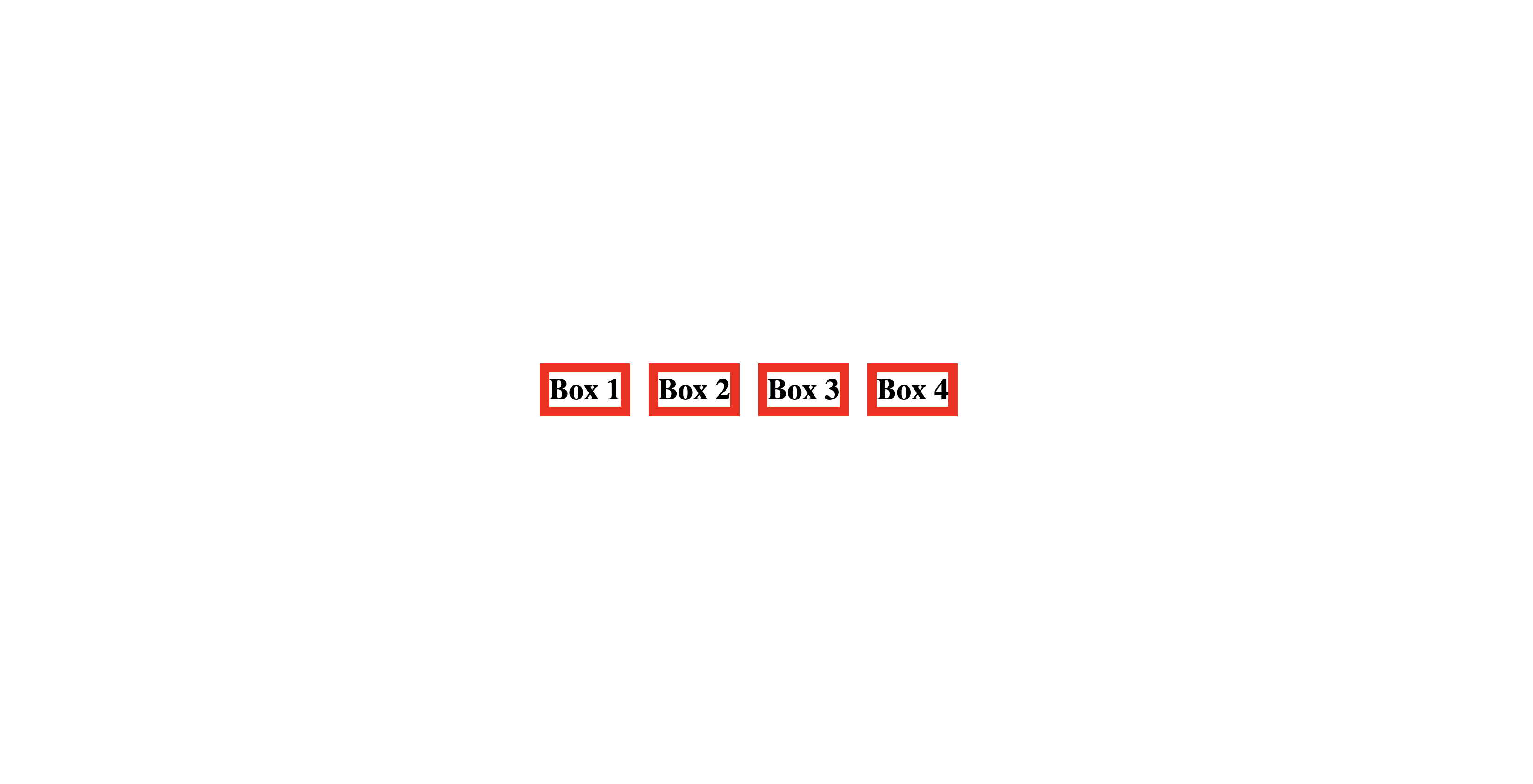
</html>And just like that, all the h1 elements are moved to the center of the screen:
There’s also the align-items property, which in this case, controls the vertical alignment of the div container. The elements are now centered horizontally, lets center them vertically as well:
<!DOCTYPE html>
<html>
<head>
	<style>
      div {
        display:flex;
				justify-content:center;
				align-items:center;
				height:100vh;
      }
		h1 {
			border: 10px solid red;
      margin-right:20px;
		}

	</style>
</head>

<body><br/><br/><br/>
	<div>
		<h1>Box 1</h1>
		<h1>Box 2</h1>
		<h1>Box 3</h1>
		<h1>Box 4</h1>
	</div>
</body>

</html>
Notice that to center the elements vertically, we also needed to add the height:100vh property, which made the div container take 100% of the viewport height of the screen (basically taking up all space on the screen). Now, the contents in your div element should be centered on your website:
If you still find it difficult to understand the flexbox layout, I encourage to play around with the properties a bit more, as well as read and view the diagrams from this article: https://css-tricks.com/snippets/css/a-guide-to-flexbox/
One you feel comfortable with the contents of this lesson, move onto the next one!